Writing
Agency Branding on a Claude Code Budget. Claude Design in Practice
April 20, 2026
The current tech discourse has a favourite narrative: developers are obsolete. Tools like Lovable and Replit mean anyone can build an app now. Your cousin can ship a SaaS product over the weekend. Who needs engineers?
I want to propose the opposite idea. Could AI be used to build an entire brand identity for discontinuity.ai — logo, colour palette, typography, brand guidelines, and website — without a designer, without an agency, without a brand strategist. Not the creative part, the mechanical part, putting the ideas together.
I’m an engineer. I’ve been writing code for twenty years. I can tell you what looks wrong, but I’ve never been able to articulate what looks right — at least not in a way a designer would recognize. I don’t think in mood boards or brand archetypes. I think in systems and specifications.
That turned out to be exactly the right way to think about this.
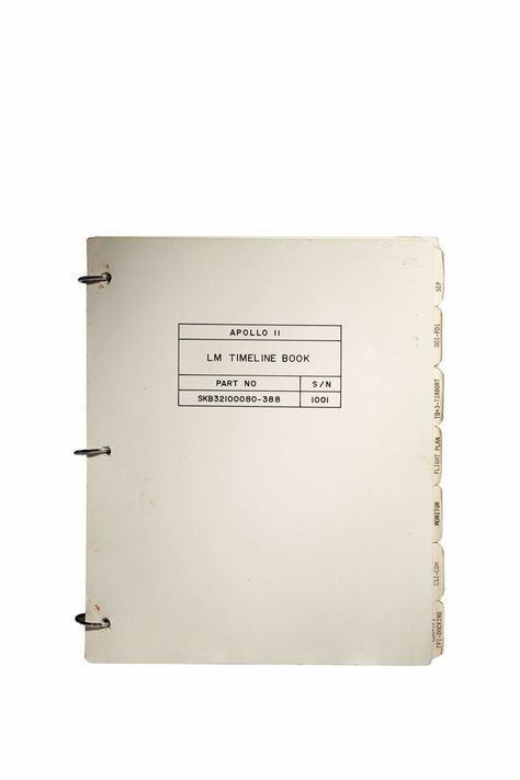
The Image That Started Everything
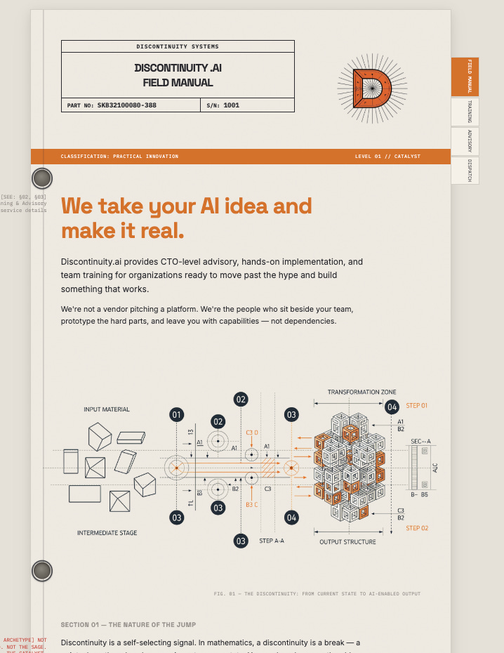
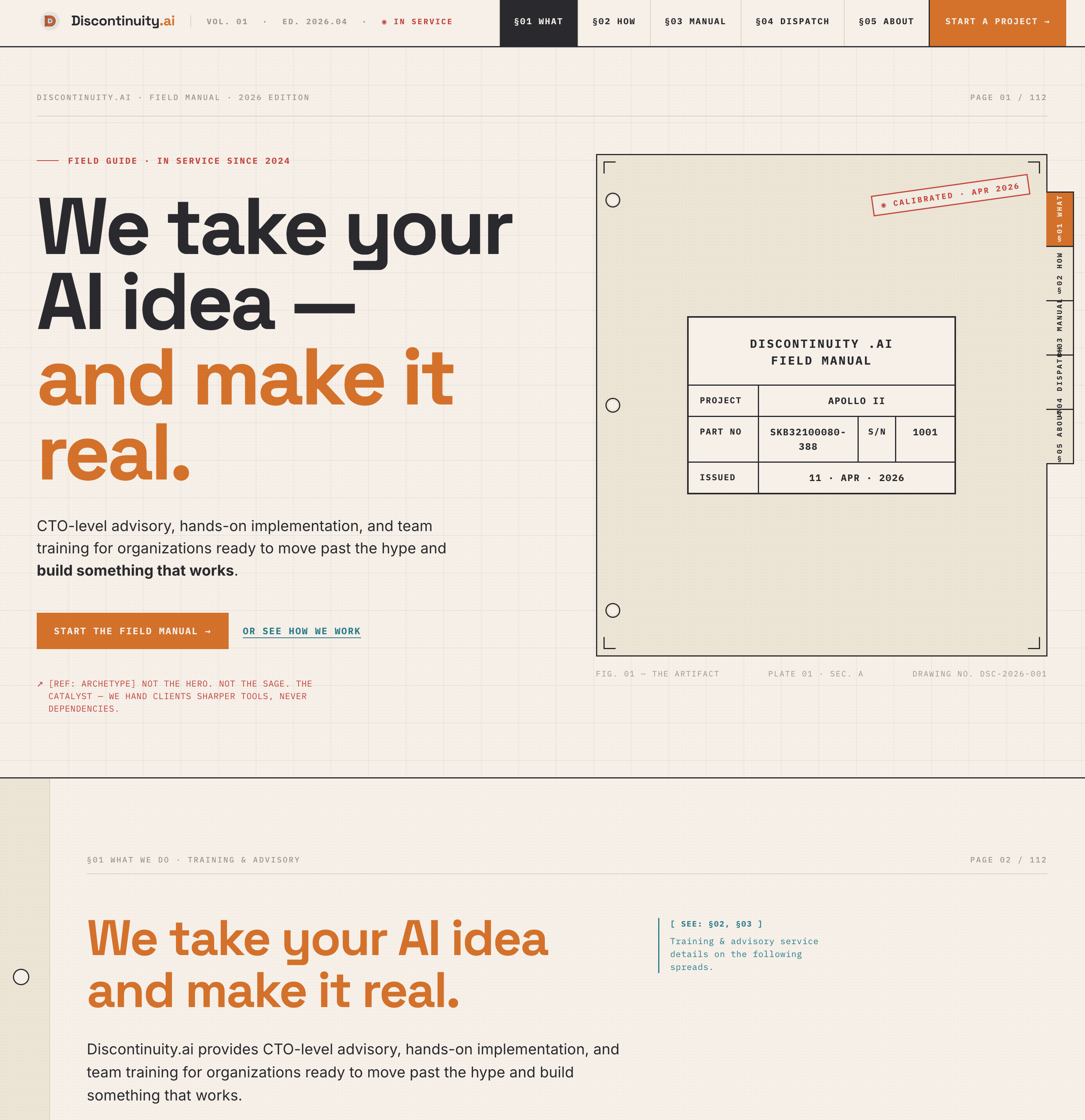
It was an Apollo 11 Lunar Module Timeline Book.
A three-ring binder. Tabbed sections — SEP, LOS-POI, FLIGHT DATA, MONITOR, CSI-CDH. Part number SKB32100080-388. Serial number 1001. The operating manual they carried to the moon.
This is what I wanted discontinuity.ai to feel like: a simple instruction manual for a complex process. Not flashy. Not trying to impress you with how futuristic it is. Just clear, precise, useful. The kind of thing an engineer would make for another engineer — because the work is hard enough without the documentation being hard too.
That’s a brand feeling. I knew it when I saw it. But I had no idea how to get from “I like the vibe of this 1960s binder” to an actual visual identity. That’s the gap AI closed for me.
The Process: From Inspiration to Brand
Here’s how the whole thing worked, step by step. I’m going to be specific about tools and workflow because that’s what I would have wanted to read before starting this.
Step 1: Mood Board and Visual Exploration (Cosmos)
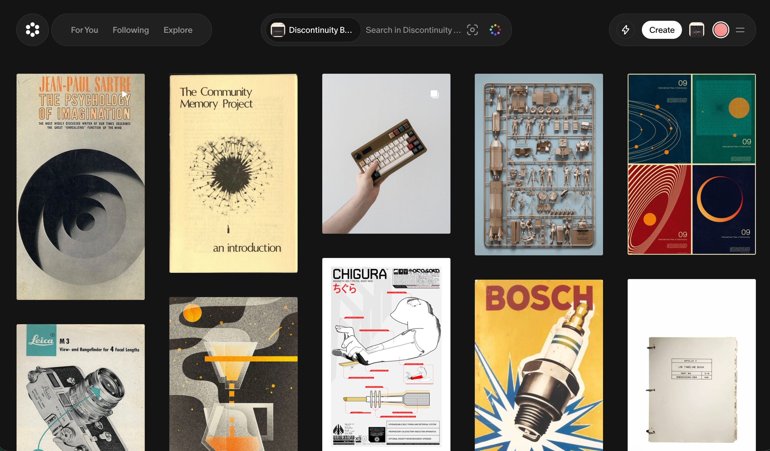
Cosmos is where the creative exploration happened. Starting from the Apollo timeline book, I went down a rabbit hole — not randomly, but thematically. I was looking for anything that reinforced the “manual for how things work” idea. Engineering documentation. Technical diagrams. Mid-century industrial design. Things that felt precise but human.
What I was actually doing, though I wouldn’t have used this language at the time, was building a mood board. Designers do this instinctively. I was doing it by searching for images that gave me the same feeling as that binder and asking myself why.
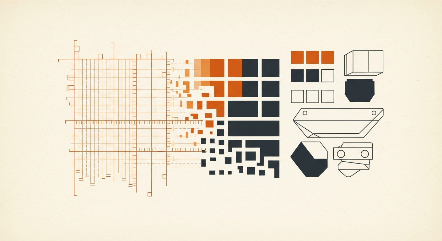
The patterns that emerged: muted, warm tones. Monospaced or technical-feeling type. Clean layouts with generous whitespace. Information density without visual clutter. The aesthetic of competence.
If you’re an engineer doing this for the first time, here’s the mindset shift: you’re not looking for things that are “pretty.” You’re looking for things that feel like your thing. The Apollo book isn’t objectively beautiful. It’s beautiful to me because of what it represents — clarity in the service of something impossibly complex.
Spend more time here than you think you need. This is the foundation everything else builds on. I probably spent two hours just exploring, saving, and refining before I moved to the next step.
Step 2: Palette and Visual Assets (Weavy.ai)
Weavy is where the mood board became something actionable. The tool lets you combine reference images and extract the parts you actually want — colour palettes, texture patterns, compositional structures.
I fed in my saved images from Cosmos and started pulling:
Color palette: Extracted from the reference images. The Apollo manual gave me the warm cream and off-white tones. Other engineering references contributed the dark backgrounds and accent colours. Weavy let me see these as actual hex values I could use.
Logo: Generated through Weavy, iterating against the palette and aesthetic I’d established. This took several rounds. The first outputs were too generic — they looked like every other AI-generated logo. I had to keep pushing it toward the specific feeling I’d captured in the mood board.
Typography direction: Weavy helped me identify the font families that matched the aesthetic. Technical, readable, precise — not decorative.
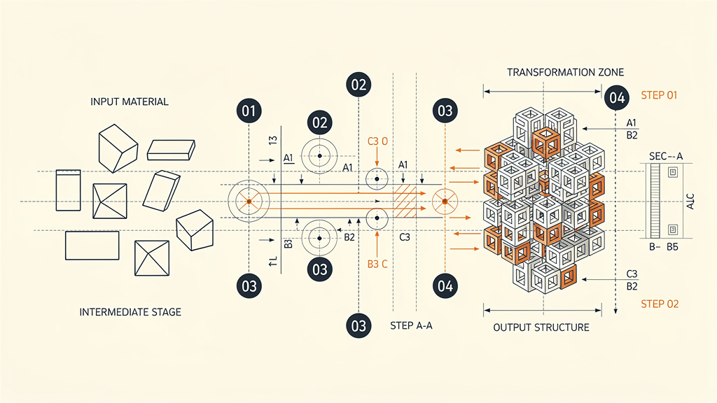
Imagery: Weavy generated some of the complex drawings on the site, not perfect but imagery that matched the aesthetic I was looking for.
The key insight: Weavy is a combining tool, not a generating from nothing tool. It’s best when you bring it strong reference material and ask it to synthesize. If you skip the Cosmos exploration step and go straight to Weavy with vague descriptions, you’ll get vague results. (Note: you probably could do all of this with a prompt, but I really did like the node style layout to see the whole picture at once.)
Step 3: Brand Guidelines (Claude)
This is where being an engineer actually helped. Once I had the visual elements — palette, logo, typography direction, reference images — I needed to codify them into a brand guidelines document. Rules. Specifications. Usage constraints.
That’s just a specification document. Engineers write specs.
I gave Claude the full context: the Apollo manual inspiration, the Cosmos exploration results, the Weavy outputs, the palette, the logo, and a description of what discontinuity.ai does and who it’s for. Claude generated a comprehensive brand guidelines document — the same document that makes life easier for developers.
Logo usage rules. Color specifications with primary, secondary, and accent palettes. Typography hierarchy. Spacing and layout principles. Do’s and don’ts. Voice and tone guidelines that matched the visual identity.
I’m not going to pretend it was perfect on the first pass. But it was structurally sound — all the sections a brand book needs, properly organized, internally consistent. I edited for substance, not structure. I may not be a designer, but as a developer I know what the document should look like.
Step 4: Design System Implementation (Claude Design)
This is where the process shifted from creating the brand to packaging it.
I had the raw materials — palette, logo, typography direction, brand guidelines document. What I needed was a proper design system: the kind of document you’d hand to a developer or a contractor and say “build to this.” In an agency engagement, that’s a deliverable unto itself — weeks of work, thousands of dollars.
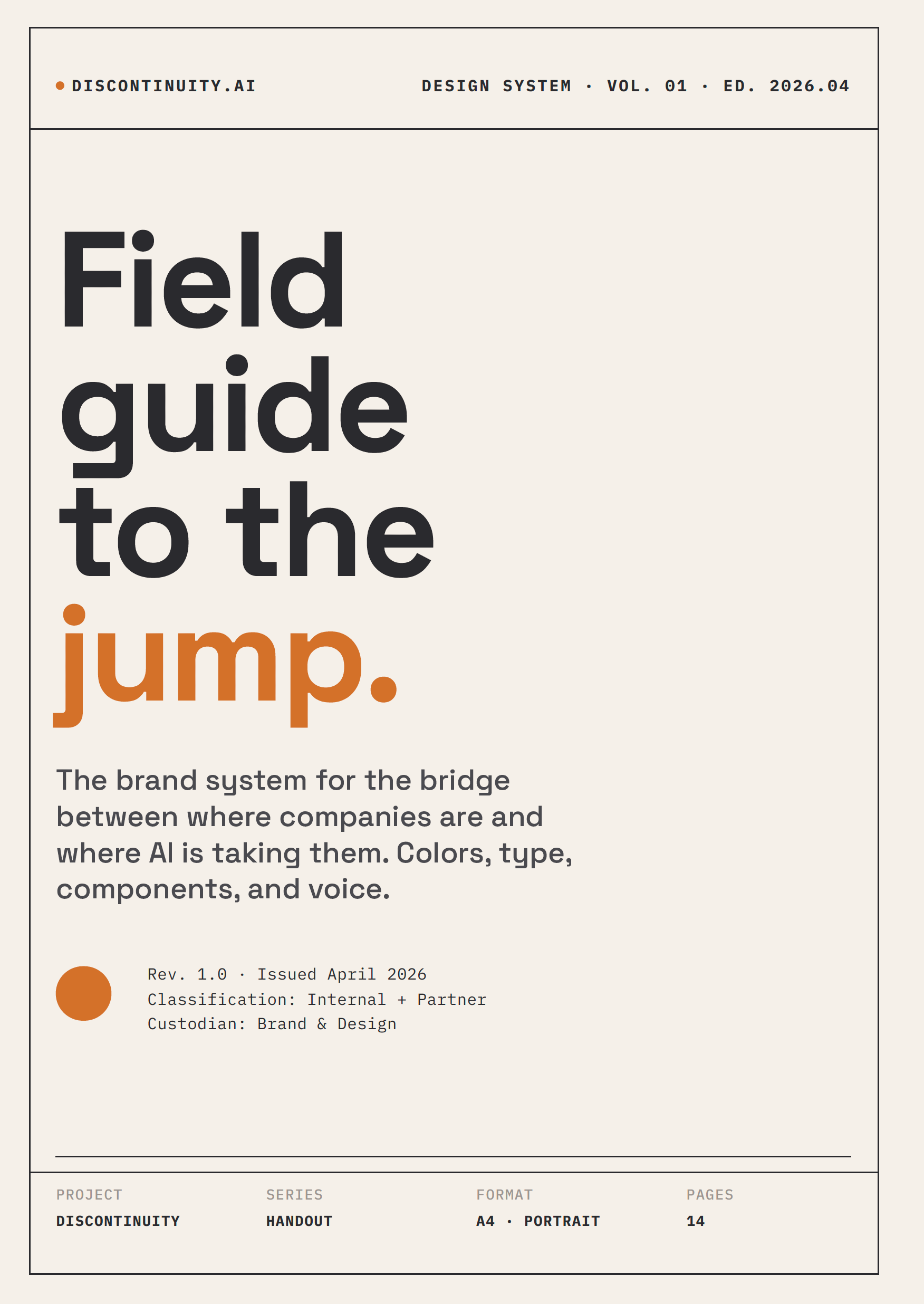
Claude Design (claude.ai/design) produced a thirteen-page design system handout. Not a summary. Not a mood board PDF. A proper field manual — “Field guide to the jump” — with colour specs (primary and extended palettes with hex values and usage ratios), typography families and scale hierarchy, spacing rules on an 8-pixel grid, component definitions, logo usage guidelines, and voice principles. It even picked up on the aesthetic I’d been building and codified it: “Field manual, not marketing brochure. Our aesthetic is mid-century technical. NASA procedures. Bosch catalogs.”
I uploaded the brand guidelines from Claude, the reference images from Cosmos and Weavy, and the palette specs. Claude Design didn’t just apply the colours — it understood why those colours worked together. The Aged Paper (#F5F0E8) became the dominant surface at 65% coverage. Burnt Amber (#D4712A) became “punctuation” — accent only, never background. It specified three fonts with three jobs: Space Grotesk for headlines, Inter for body, IBM Plex Mono for labels and callouts. It even wrote the rules I didn’t know I needed: “No rounded corners. No gradients. No drop shadows. These are soft consumer signals.”
That’s the kind of output that makes you sit back. I didn’t tell it to ban rounded corners. It derived that from the Apollo manual aesthetic. It understood the design language better than I could have articulated it.
The design system handout is now hosted on the site — it ships with the brand, not as documentation about the brand, but as part of it.
Step 5: Website Code (v0)
The final step: take the design system mockups and turn them into a live website.
I used Vercel’s v0 for this, feeding it the brand guidelines document, the Claude Design mockups, and the visual assets. Having actual mockups to reference — not just a brand book — made a real difference. v0 had a clear target to hit rather than interpreting abstract guidelines.
And I still need to be honest: the first several iterations were not good.
v0 gave me technically functional pages that hit the brief on paper — right colours, right fonts, right layout structure. But they felt flat. No polish. No craft. The kind of output that makes you think “this is technically correct but something is off.” Site builders optimize for speed and functional correctness. They do the minimum for UX.
Here’s what I learned: do not accept the first output. Or the second. Probably not the third.
Each iteration, I’d identify what was missing — not enough whitespace here, the typography hierarchy doesn’t feel right there, this section needs more visual breathing room, the hover states are too subtle. Small things that compound into the difference between “AI-generated website” and “website that happens to have been built with AI.”
This was the most iterative part of the process. The earlier steps — mood board, palette extraction, guidelines, mockups — each had a relatively clear done state. The website implementation was more like sculpting: you keep removing material until it feels right.
I probably went through eight or ten rounds of revision before I was satisfied. That’s still a day of work, not a month. But it’s an honest day — not the “I typed one prompt and got a perfect website” story that AI marketing wants to sell you.
Claude Design
(at the time of the publishing Claude Design is still in research preview)
v0 is a good tool for basic website work, it handles hosting and setup at the same time. The editor for code is rather simplistic so I probably spun my wheels a lot to get it working correctly. Anthropics new release, Claude Design is a fantastic tool.
If they can fix some of the bugs (web rendering doesn’t work right), the tool will be fantastic.
What I Did vs. What AI Did
The series pattern applies here too.
AI did: Visual exploration at scale (Cosmos). Palette extraction and synthesis (Weavy). Logo generation. Brand guidelines structure and drafting (Claude). A thirteen-page design system handout with colour specs, typography hierarchy, spacing rules, components, and voice guidelines (Claude Design). Website code generation (v0). The tedious, iterative, production work of turning ideas into assets.
I did: The creative direction. Knowing what felt right when I saw it. Choosing the Apollo manual as the anchor. Deciding which colours, which fonts, which layouts reinforced the “simple manual for complex things” idea. Pushing back on outputs that were technically correct but emotionally flat. Every revision that moved from “generic” to “ours.”
The judgment was the bottleneck. Same as SOC2, same as Claw. AI didn’t replace taste — it let me implement taste fast enough that “rebrand the company” became a day project instead of a quarter-long agency engagement.
What I’d Tell a Developer Doing This for the First Time
You don’t need to know design vocabulary. You need to know what you like.
Start by collecting. Browse Cosmos, Pinterest, Dribbble — anywhere visual. Save everything that gives you the feeling you want your brand to have. Don’t analyze it yet. Just collect.
Then look at what you collected and ask: what do these have in common? That’s your brand direction. Not “I want a modern minimalist brand” — that’s a design cliché. More like “I want it to feel like an engineering manual from the Apollo program.” Specific. Personal. Weird. That’s what makes it yours.
From there, the tools will carry you. Weavy for extraction and synthesis. Claude for codification. Claude Design for mockups and collateral. v0 or similar for the live site.
The places you’ll get stuck:
The “good enough” trap. First outputs from site builders look passable. They’re not done. Keep pushing.
The vocabulary gap. You’ll see something that’s wrong but not know the design word for it. That’s fine. Describe what you see, not the concept. “This text is too close to the edge” is more useful than trying to remember the word “margin.”
The taste question. At some point you’ll wonder if your taste is good enough. It is. You’re building your brand, not a design portfolio. Authenticity beats polish.
Where I’d Still Hire a Designer
Motion and animation. I can evaluate static layouts but I have no intuition for how things should move. If discontinuity.ai needed complex transitions or animated interactions, I’d hire someone.
Print and physical media. Business cards, conference banners, merchandise — anything that involves print production specs and CMYK colour profiles. Different world.
Brand strategy at scale. I rebranded a consultancy with one person (me). If I were rebranding a company with fifty employees, multiple product lines, and existing brand equity to protect, I’d want a strategist who understands how brands work at organizational scale. Exactly like coding, Lovable can build you a prototype but I wouldn’t run a business with it.
The AI tools gave me enough capability to get from zero to credible for a solo consultancy brand. That’s a real and useful thing. It’s not “designers are obsolete” — it’s “the threshold for needing a designer just moved.”
This is the third piece in the “Built in a Day” series. #1 was How to Build a Claw That Won’t Eat You — knowledge worker automation. #2 was SOC2 Ready in a Day — compliance automation. Same pattern: practitioner with domain context uses AI to collapse implementation time on something that normally costs five figures.
The before/after is live at discontinuity.ai. I’m considering open-sourcing the brand process templates, prompt libraries, and workflow documentation — if that’d be useful, let me know.
Originally published on Discontinuity